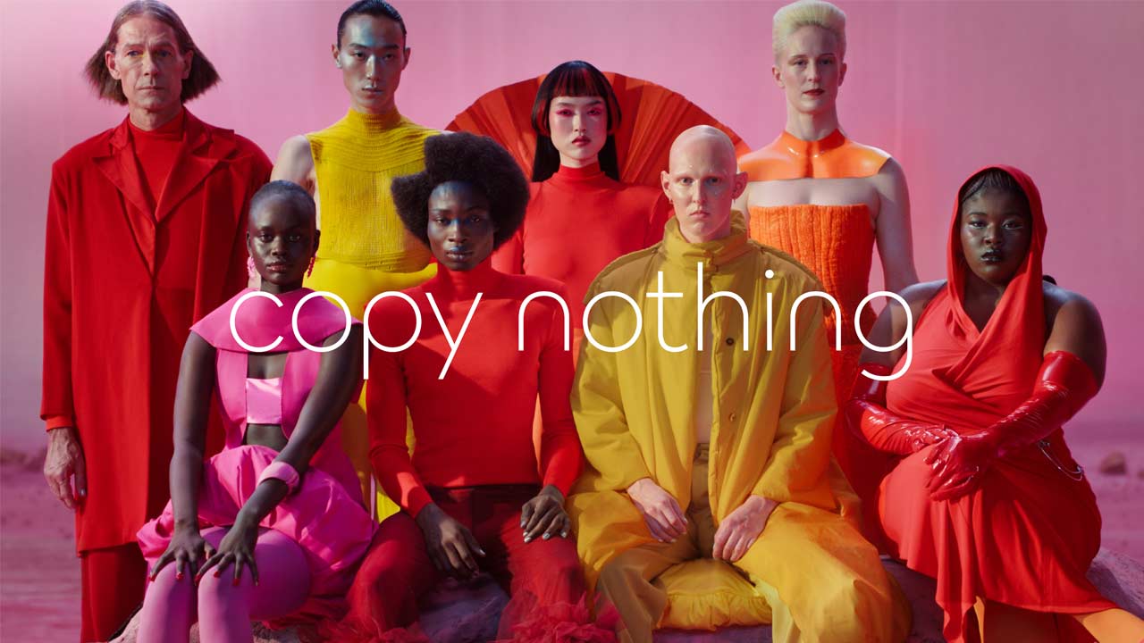
“Copy Nothing”, “Delete Ordinary”. Yet, copy every single DEI/Pride campaign.
Well, let me start by saying that I’ve nothing against the LGBTQIA+ community, or the “alphabet people” as Dave Chappelle likes to refer them. I think everyone should be allowed to dress the way they like and suck whatever they like. Who am I to judge that, right? The only problem I have is with the “T” people sTealing medals in sporting events.
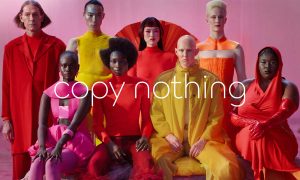
But anyway, the news is that Jaguar, the car brand Jaguar, has made a disastrous attempt at “re-inventing” its brand, and the response is so strong on the internet that the marketing team is being accused of deleting comments on the brand’s social accounts. The strong response is not only from the brand enthusiasts but also from the current and ex-Jaguar owners who are considering severing their association with the brand. In case you have not seen the controversial campaign yet, here’s the official video:
The video looks awfully cliché. I mean, we all have seen such DEI/Pride-themed videos before; such videos date back to 10-15 years. This particular video contains eye-harming gaudy-colored props and clothes and 8 individuals of different racial backgrounds. These individuals look more like robots rather than homo sapiens. Out of 8, 3 appear to be black females, an Asian female, and the remaining appear to be so-called “gender fluid”. But I’m just guessing. Of course, what makes this re-branding video so disastrous is the complete disregard for the brand’s rich history! There’s no inclusion of the brand’s cars or any part of the brand’s history. A person with no knowledge of cars/car brands would assume that this video is of a (clown) fashion/clothing brand.
Take a look at the before and after photos I’ve posted on my Instagram. The iconic Jaguar roundel has been replaced with two inverted ‘J’s, which makes it look more like a cheap Chinese knock-off of an Italian fashion brand, while the JAGUAR wordmark has been replaced with a lousy wordmark made out of circles. When I was doing graphic designing 15 years ago, making logos out of circles was my then favorite idea. What’s interesting about this “new” wordmark is that the letters JGU are in caps while the rest are in small.
I’m not entirely sure what’s going on at Jaguar, but if the sole intention of this re-branding is to get strong reactions and get people talking, well then, congratulations, they’ve achieved the goal. But people are not just talking, they’re sh*tting on this re-branding, and rightfully so. This is disastrous, plain and simple.
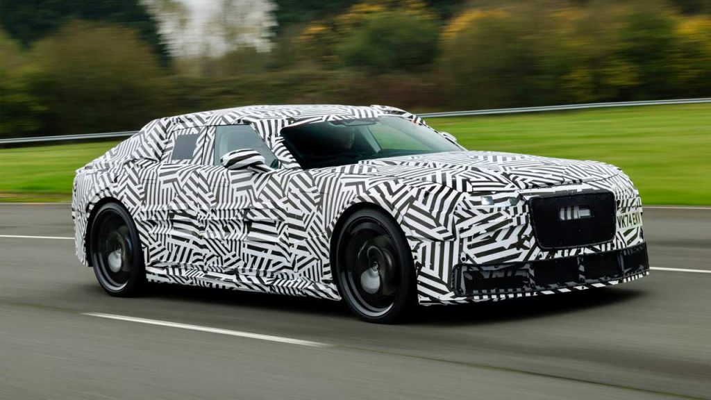
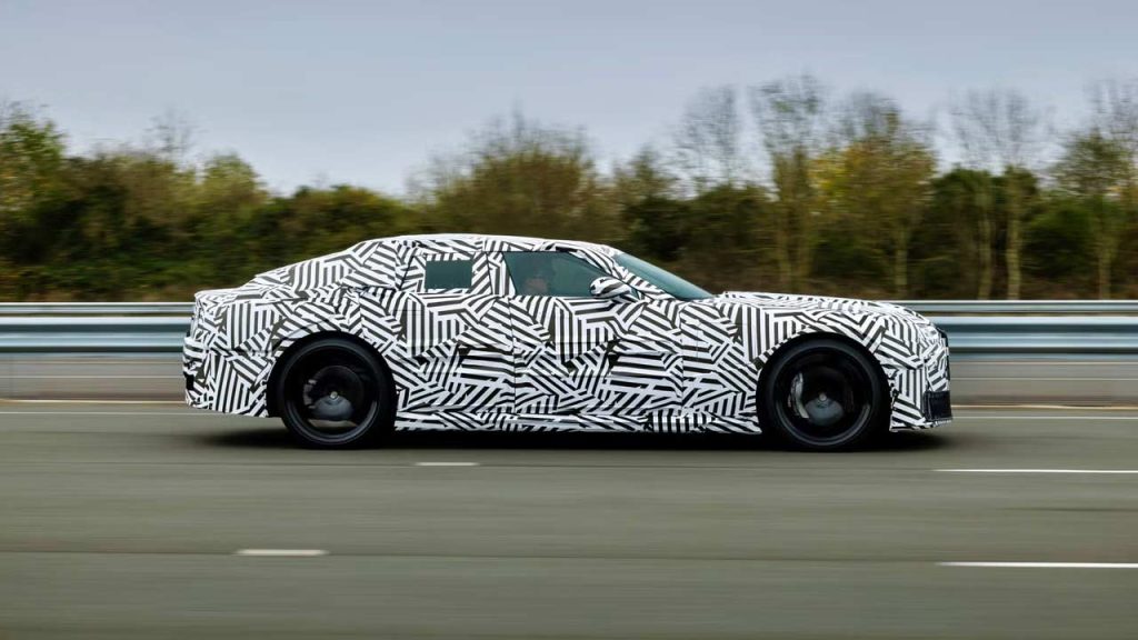
The brand is expected to reveal a new four-door electric grand tourer in Miami next month, at the Miami Art Week. So, expect tons of alphabet people in attendance to drool over this new “fearless, exuberance”.
Someone certainly owes Sir William Lyons an apology. But anyway, so long Jaguar, it was nice knowing you.

Leave a Reply
Note: Comments that are unrelated to the post above get automatically filtered into the trash bin.
